Designing for scientists, engineers and everyone in between


One of the more interesting challenges of working with science and technology companies is that the same information can mean something completely different depending on who's looking at it. A scientist might want to understand the methodology behind a breakthrough. An engineer wants to know how something works, what its limitations are, and whether it can be integrated into an existing system. An investor is interested in commercial viability. A potential customer simply wants to know whether it solves their problem.
They're all evaluating the same technology, but they're asking very different questions. As a designer working across technical industries, I've found this to be one of the most interesting parts of the job. You're rarely designing for a single audience. You're often trying to help people with entirely different backgrounds understand the same underlying idea, without compromising the information that makes it credible.
And that's a more complicated design problem than it might first appear.
Expertise isn't a hierarchy
There's a tendency to divide audiences into two groups: technical and non-technical. It's a useful starting point, but it doesn't tell the whole story. Someone can be exceptionally knowledgeable in one discipline and completely unfamiliar with another. A molecular biologist might understand cellular processes in extraordinary detail but have little experience evaluating enterprise software. A software engineer might understand machine learning architecture but know very little about the regulatory requirements of medical devices.
Neither person lacks intelligence or expertise. They're simply approaching the information with different knowledge. This distinction matters because it changes how you design. When you assume an audience is less capable, the temptation is to remove complexity. When you recognise that their expertise is different, you start thinking about which context they need to make sense of the information.
Research supports the importance of this distinction. A 2021 study published in Proceedings of the Royal Society B analysed 21,486 scientific papers in cave research, a multidisciplinary field. It found a negative association between the use of specialised jargon in titles and abstracts and the number of citations those papers received. It's a correlation within a particular research field, not proof that jargon causes lower citation rates everywhere. But it's an interesting reminder that specialised language can create barriers even between scientists.
The point isn't to eliminate technical terminology. It's to recognise when the terminology is helping people understand something and when it's creating unnecessary work.
The same technology, different questions
Imagine a company developing a predictive maintenance platform for industrial batteries. An engineer evaluating the platform might want to understand its data inputs, anomaly detection methodology, integration requirements and operational limitations. An operations manager is likely to have a different set of concerns. How will the system affect existing workflows? What happens when an alert is triggered? Does it require specialist training? A commercial decision-maker might be interested in implementation costs, measurable operational improvements and evidence of financial return.
If you tried to communicate everything to everyone at once, you'd probably end up with a very complicated website, presentation or product demonstration. But creating completely separate narratives introduces another problem. The technical team might describe the platform one way, marketing another, and sales something else entirely.
Good communication needs a consistent foundation, even when the details change. For me, this is where design becomes particularly valuable. You're creating a structure that allows different audiences to find the information relevant to them, while maintaining a coherent explanation of what the technology actually does.
Design around the decisions people need to make
A useful question to ask at the beginning of a technical design project is: What does this person need to understand before they can make a decision? It's a different question from asking what information the company wants to communicate.
For a scientist reviewing a research presentation, that decision might involve evaluating whether the evidence supports the conclusion. For an engineer, it might be determining whether a proposed solution is technically feasible. For an investor, it might be deciding whether the opportunity warrants further investigation. Those decisions determine which information deserves prominence.
You can see this in the way a well-designed investment presentation differs from a technical research paper. Both may reference the same underlying science, but the hierarchy, supporting information and expected level of detail are different. A research paper needs to make its methods and findings available for scrutiny. An investment presentation needs to establish a compelling commercial argument while providing enough evidence to support its claims. Neither format is inherently more sophisticated. They're designed to do different jobs.
This is also why I don't think every audience needs an identical explanation. Consistency is important, but consistency shouldn't mean forcing everyone through the same experience.
Make the evidence accessible, not just the explanation
Technical communication has a responsibility that goes beyond making things easy to read. It needs to preserve the integrity of the information. This is particularly important in fields such as biotechnology, healthcare, AI and clean energy, where the distinction between demonstrated results and anticipated outcomes can be significant.
Take an early-stage biotechnology company communicating promising research findings. A technical audience might understand the study conditions, sample sizes and limitations immediately. A broader audience may focus on the headline result without recognising those qualifications. If the design gives enormous prominence to a positive outcome while burying the limitations in small print, the result can be misleading, even when every individual statement is technically correct.
The European Food Safety Authority's guidance on communicating scientific uncertainty emphasises maintaining consistency between the strength of the underlying evidence and the language used to present it. It also recommends making assumptions and limitations clear. That's a valuable principle for any technical organisation.
Visual hierarchy, headlines, charts and imagery all influence how people interpret information. As designers, we need to think about what those choices imply, not just how they look. Sometimes that means pushing back on a headline that's a little too ambitious. Sometimes it means finding a clearer way to represent uncertainty or adding context that makes an impressive statistic genuinely meaningful.
Credibility comes from communicating the evidence accurately, not simply making it look convincing.
Different ways into the same information
I often think about technical content as a collection of connected entry points rather than a single linear explanation. On a website, someone might arrive through an industry-specific page, a technical documentation page, or a case study. In a presentation, one audience might be interested in the commercial opportunity while another wants to examine the technical methodology.
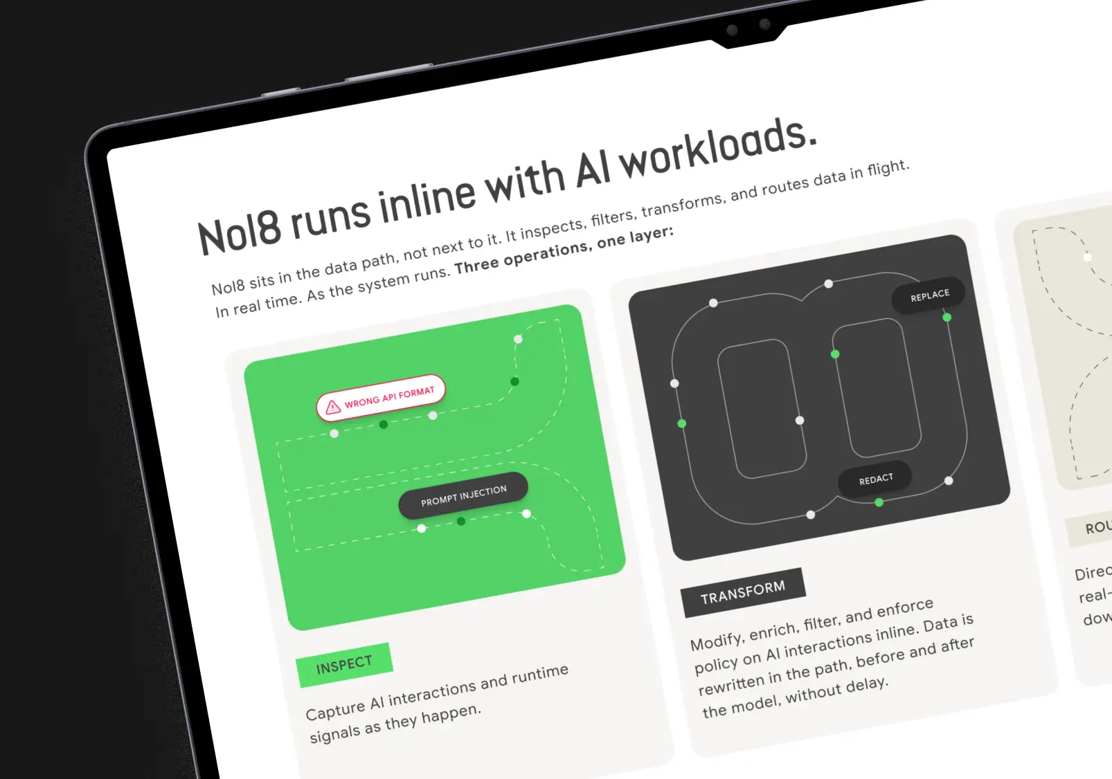
The design should accommodate those different interests without making the information feel fragmented. This can influence everything from information architecture and navigation to typography, diagrams and data visualisation. For example, a sophisticated technical diagram might be exactly what an engineer needs. But the same diagram could benefit from a short explanation of what it represents and why it matters, particularly when it's being shared with a broader audience.
The UK's Office for National Statistics recommends designing visualisations around the comparison or finding readers need to understand. Its guidance also emphasises clear labels, appropriate chart types and contextual information. I think that's particularly relevant in scientific and engineering communication, where the temptation can be to include every available data point.
More information doesn't automatically make something more informative. A carefully chosen comparison, a clearly labelled diagram or a thoughtfully structured page can make the underlying evidence easier to evaluate without changing the evidence itself.
Don't assume jargon creates credibility
Technical language absolutely has its place. Within a specialist audience, it makes communication faster and more precise. But terminology can also become a kind of shorthand for credibility, particularly in marketing materials.
A 2020 study published in the Journal of Language and Social Psychology examined how jargon influenced people's engagement with scientific information. In an experiment involving 650 participants, researchers found that technical jargon made information harder to process, even when definitions were provided. It also affected participants' reported understanding and sense of connection with the scientific community. That's worth thinking about when you're trying to build trust with an audience outside your immediate field.
Using specialist language doesn't necessarily make your organisation appear more sophisticated. Sometimes it simply makes people feel that the information wasn't intended for them. I don't advocate removing every acronym or rewriting technically accurate terminology into vague marketing language. Instead, I think the important distinction is between terminology that communicates something specific and terminology that's there primarily to sound impressive.
If a term is necessary, use it. If the audience might not recognise it, provide the context. And if there's a clearer way to communicate the same idea without losing accuracy, that's usually worth exploring.
The importance of getting the right people involved
Some of the most useful feedback on a technical design project comes from people who see the work from completely different perspectives. An engineer might immediately identify an inaccurate representation of a system. A researcher might notice that a diagram implies a relationship the evidence doesn't support. Someone from a commercial team might point out that the most important customer benefit is difficult to find. And someone unfamiliar with the technology might ask a question that everyone internally stopped asking years ago.
All of those perspectives are valuable. I think designers working in technical industries need to be comfortable moving between them. That means asking questions, challenging assumptions and recognising that a visually compelling solution isn't necessarily a technically accurate one. It also means knowing when to defer to the subject matter experts.
The most effective approach is collaborative: technical specialists ensure the information is correct, while design helps structure, contextualise and communicate it for the intended audience.
Good technical design respects the audience
There's something particularly satisfying about helping someone understand a subject they previously found difficult to approach. Not because you've made the subject less complex, but because you've helped them navigate it.
Scientists, engineers, executives, investors and customers all bring different experiences and expectations to the information in front of them. Designing effectively for those differences requires more than changing the vocabulary or adjusting the amount of detail. It requires understanding what each audience already knows, what they need to learn and what they're trying to accomplish.
For technical organisations, that understanding can make the difference between information that's technically impressive and communication that's genuinely useful. And when you're working with people developing remarkable technologies, making their work understandable to the people who need it is a pretty meaningful thing to contribute.
Research referenced
- National Academies of Sciences, Engineering, and Medicine — Communicating Science Effectively (2017)
- Royal Society — Specialized terminology reduces the number of citations of scientific papers (2021)
- Shulman et al. — The Effects of Jargon on Processing Fluency, Self-Perceptions, and Scientific Engagement (2020)
- Office for National Statistics — Data Visualisation Principles
- European Food Safety Authority — Guidance on Communication of Uncertainty in Scientific Assessments