How to communicate complex technology without oversimplifying it

Making sophisticated ideas easier to understand doesn't mean making them less sophisticated. One of the things I love most about working with technology companies is getting to learn about something entirely new.
Over the years, I've worked across industries ranging from AI and biotechnology to clean energy and infrastructure. Each comes with its own language, challenges, and occasionally, a collection of acronyms that could fill a small dictionary. The technology is often fascinating. Explaining it to someone outside the industry? That's where things get interesting.
There's a delicate balance between making something accessible and stripping away the details that make it valuable. Get it wrong, and you either overwhelm your audience or leave them with such a simplified explanation that they don't really understand what makes your technology different.
The goal isn't to make complex technology sound simple. It's to make it understandable.
The curse of knowing too much
When you're deeply involved in developing a product or technology, it's easy to forget how much knowledge you've accumulated along the way. Engineers, researchers, and founders understand the nuances of what they're building. They've spent months or years solving problems, refining systems, and making decisions that most people will never see. Naturally, they want to explain all of it.
But your audience is coming from a very different starting point. A potential customer might want to know how your technology solves a problem. An investor might be interested in its commercial potential. A technical partner might need to understand exactly how it works.
They're all looking at the same technology, but they need different information to make sense of it. That's why good communication starts with understanding who's on the other side of the conversation.
You have less time than you think
Research from Nielsen Norman Group found that people often leave web pages within 10–20 seconds, and that a clear value proposition is important for holding their attention. The research dates back to 2011, but it illustrates a challenge that remains familiar: people need to understand why something matters before they'll invest time learning more.
For a technology company, that first impression can be particularly difficult. If your homepage opens with a paragraph full of technical terminology, visitors may never get far enough to discover what makes your product remarkable.
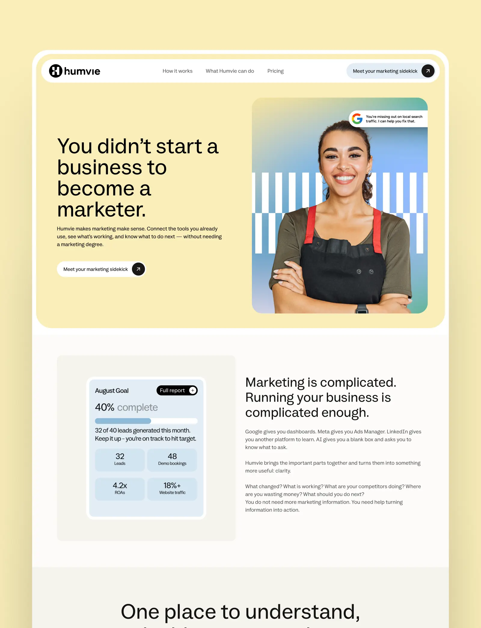
I like to think of communication in layers. The first layer explains what you do and why it matters. The next introduces how your technology works. From there, people can explore the technical detail, evidence, specifications, and research that support your claims. You're not removing information. You're putting it in an order that makes sense.
Start with the problem, not the technology
Imagine you're developing an AI-powered platform that helps construction companies manage administrative work. You could begin by explaining its machine learning architecture, integrations, and automation capabilities. Or you could start with something your audience immediately recognises: builders spending their evenings catching up on paperwork instead of doing the work they actually enjoy. Both explanations might be accurate. But the second gives people a reason to care about the first.
Once someone understands the problem, they're much more receptive to learning about the technology behind the solution.This doesn't mean every piece of communication needs an emotional story. Sometimes a clear, practical explanation is exactly what's needed. It simply means starting somewhere familiar before introducing something new.
Visual design can do what paragraphs can't
Some ideas are genuinely difficult to explain through words alone.
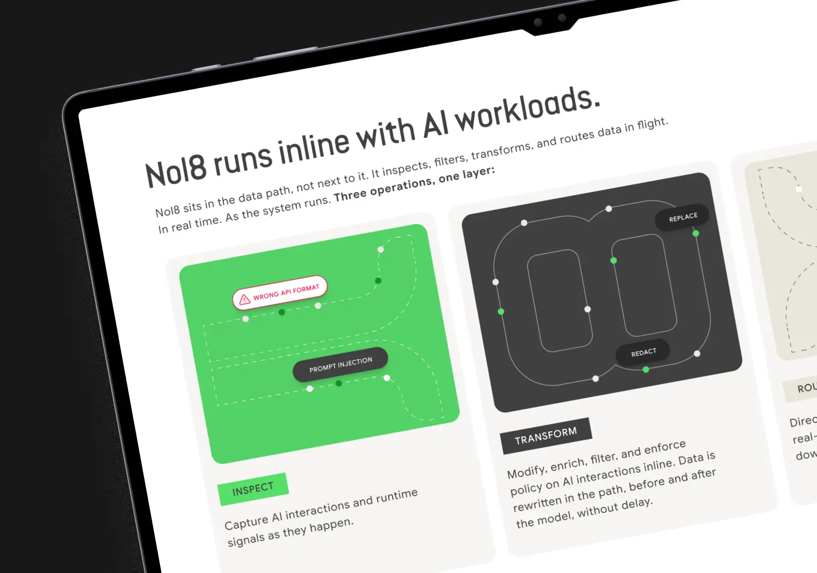
Think about a complicated data flow, a scientific process, or a platform connecting multiple systems. You could describe every relationship in a few dense paragraphs, but a carefully designed diagram might communicate the same information much more effectively.
That's where I find design particularly rewarding. A good infographic can reveal patterns in data. A product interface can demonstrate how a complicated process becomes manageable. An animation can show something that would otherwise be invisible. Even something as straightforward as typography and spacing can help people understand which information matters most.
The World Wide Web Consortium's accessibility guidance recommends clear language, shorter blocks of text, understandable images, and well-organised layouts to support comprehension. These aren't just accessibility considerations. They're useful principles for communicating complicated information to anyone.
Of course, visual design can introduce its own problems. An elaborate diagram isn't helpful if nobody can follow it. Beautiful data visualisation is meaningless if the numbers are misleading. And an impressive animation can easily distract from the point you're trying to make.
Good design should clarify the information, not compete with it.
Don't be afraid of technical detail
One mistake I see in technology communication is the assumption that making something accessible means removing anything technical. I don't agree.
Technical detail is often what gives a product its credibility. It's how a company demonstrates that its claims are supported by real engineering, research, or expertise. The trick is knowing when to introduce it.
A potential customer shouldn't need a background in machine learning to understand what your AI product does. But a technical evaluator should be able to find meaningful information about its capabilities and limitations. Similarly, a biotech company needs to communicate the potential significance of its research without overstating what the evidence proves. That distinction matters.
Clarity shouldn't come at the expense of accuracy.
Bring the experts into the process
Some of the most valuable conversations I have during a design project are with the people closest to the technology. Not just marketing teams, but engineers, researchers, product managers, and founders.
I ask a lot of questions. What does this actually mean? Why is this approach different? Which details are essential? What would someone misunderstand if we explained it this way?
Sometimes the answers lead to a completely different way of presenting the information. And sometimes they reveal that what initially sounded like the most impressive feature isn't actually the thing customers care about most.
Designing for technical industries requires curiosity and a willingness to keep asking questions until the information makes sense.
Make room for understanding
The best technology communication doesn't talk down to its audience, and it doesn't expect everyone to arrive with specialist knowledge. It respects both the complexity of the subject and the intelligence of the person trying to understand it.
Whether you're creating a website, investor presentation, product interface, or marketing campaign, the challenge is much the same: find the right balance between clarity, accuracy, and detail. Because when people understand what you've built, they're in a much better position to recognise its value.
And remarkable technology deserves to be understood.
Research referenced
- Nielsen Norman Group — How Long Do Users Stay on Web Pages? (2011)
- W3C — Use Clear and Understandable Content